Packaging /advertising / 2017
2018 Adobe Design Achievement Awards : SEMIFINALISTNin Jiom Herbal Syrup Rebranding
Duration :
Sep. - Dec. 2017 (3 months)
Used Tool :
Adobe Illustrator, InDesign, Photoshop
Laser cutter - Speedy 300 trotec
Sticker Printing - Roland Print & Cut
NIN JIOM
Nin Jiom is a popular cough syrup in the Chinese community, with a history that can be traced back to the Qing Dynasty. Nin Jiom means “remembrance of the mother”, a Chinese medicine doctor, IP Tin-see, invited the syrup, made with 15 herbs, 200 years ago but it was not until 1946 when the syrup was first introduced to the Asian market, including China, Korea, and the South-East Asian counties.
First Nin Jiom package ( Image from ninjiom.com )
Current package in Hong Kong ( Image from ninjiom.com )
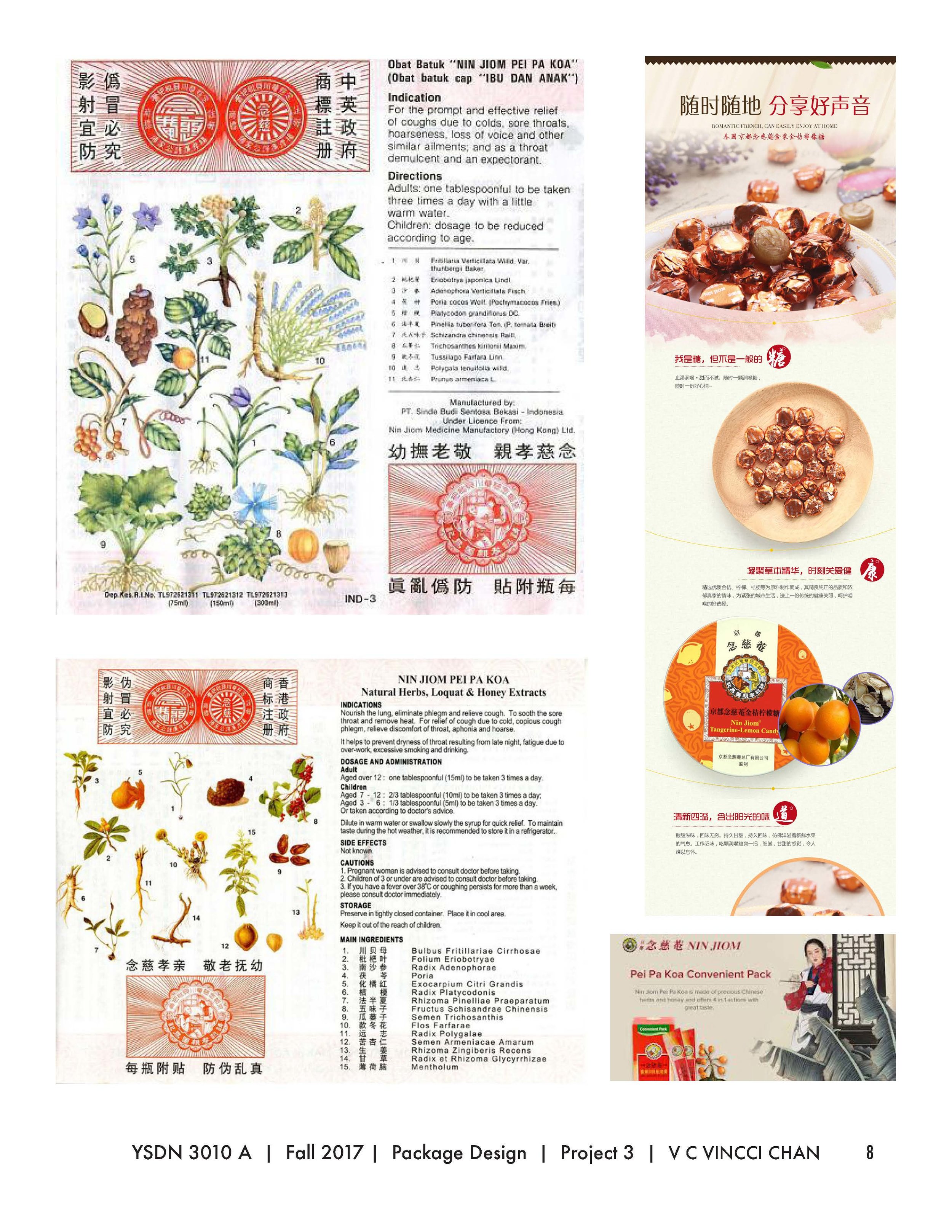
Current information sheet in Hong Kong, and China
EVOLUTIONAL REDESIGN
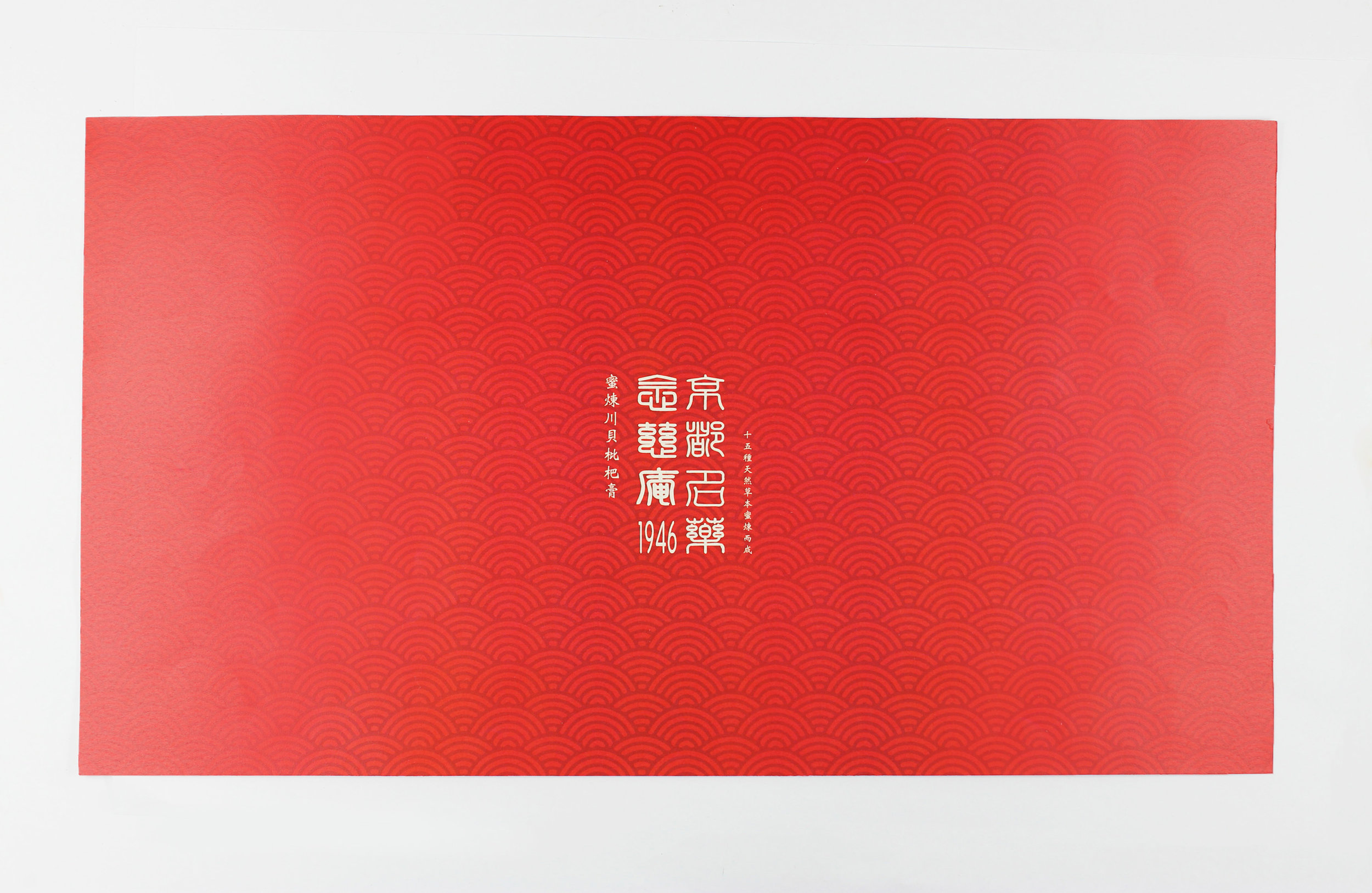
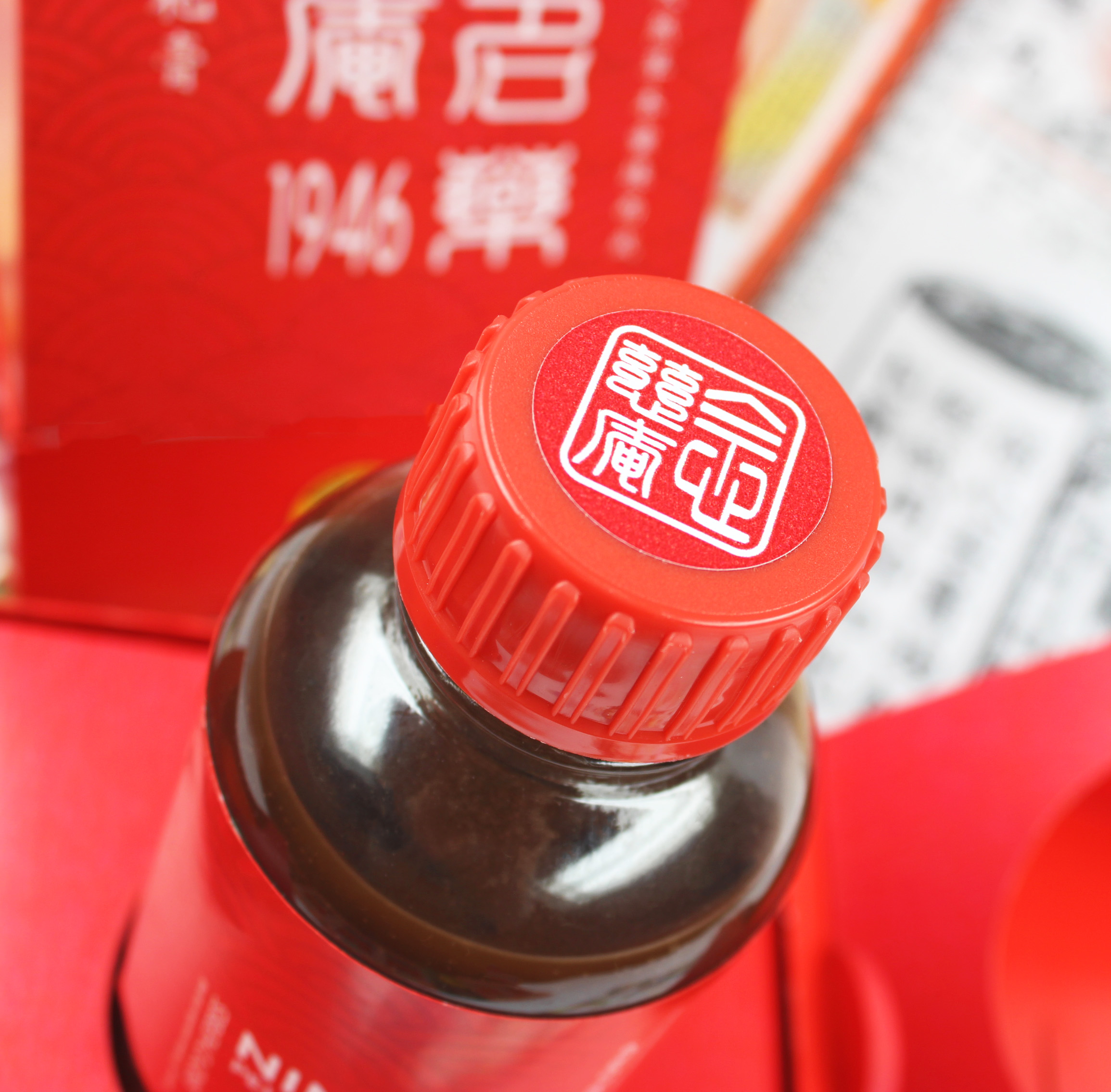
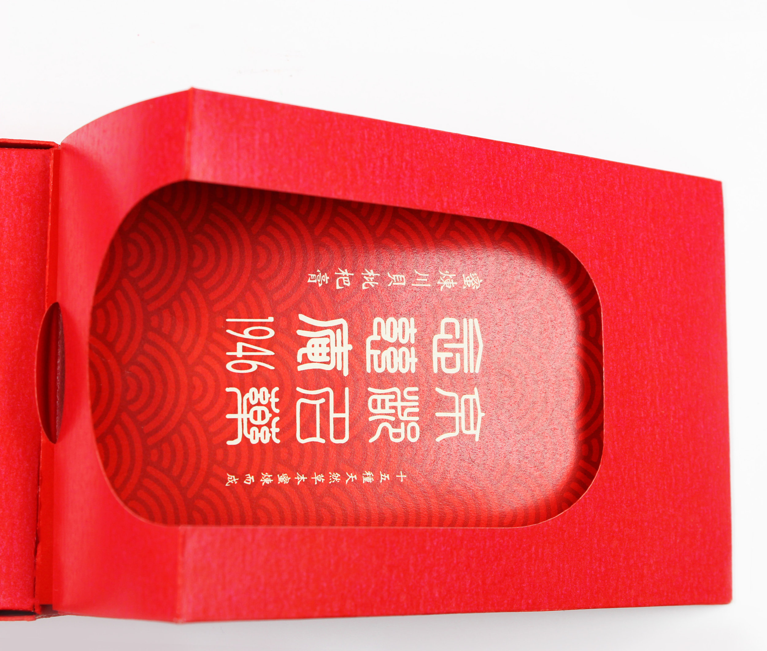
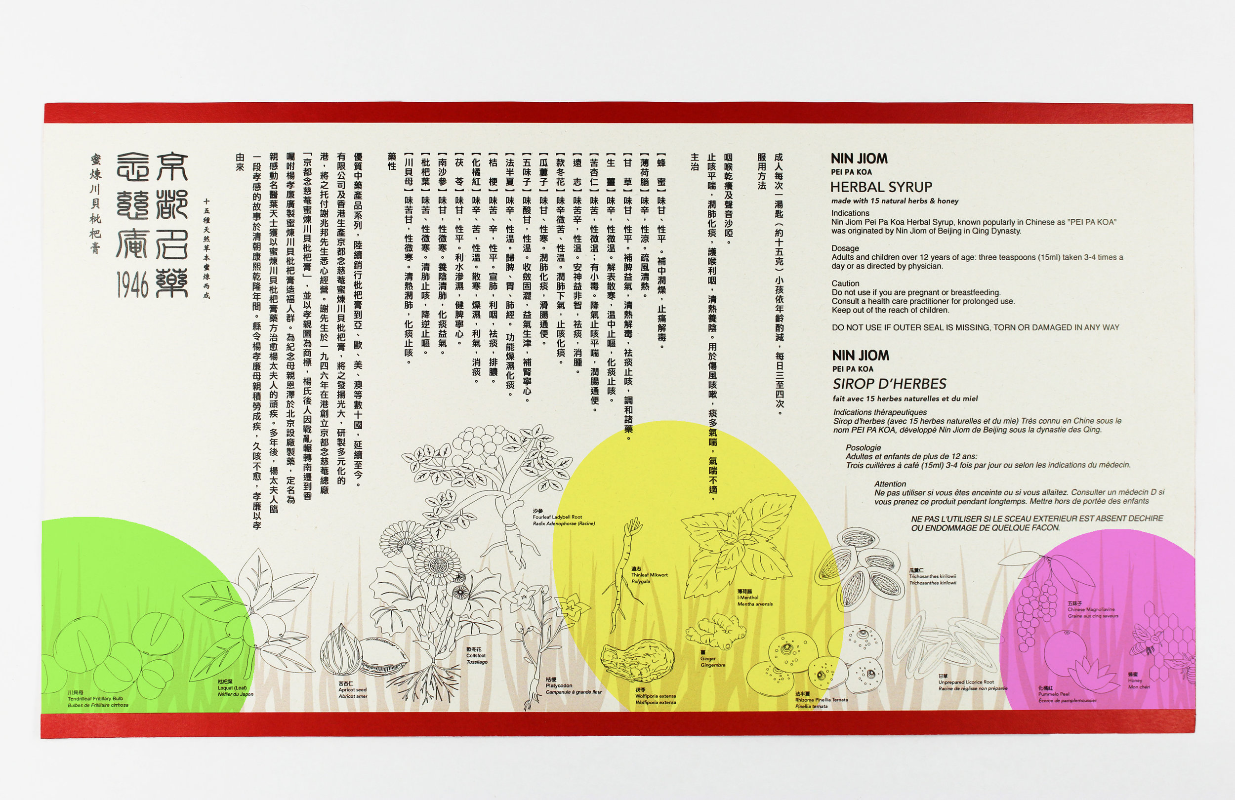
To rebrand and expand the market in the West, this new design takes a different approach and direction when coming up with an innovation, functional, and user-friendly design for the Canadian market, using three languages, Chinese, English, and French. The brand identity reflects design strategy while retaining original logo but reposition the packaging format. The project modernizes while respecting the existing design.
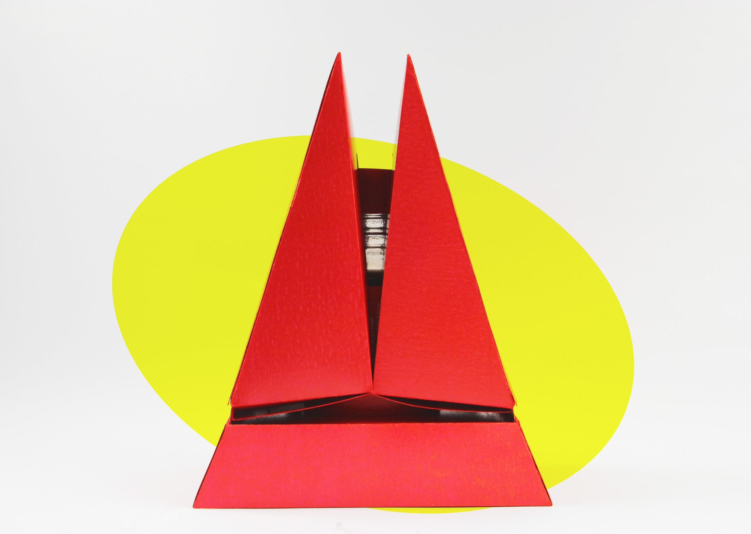
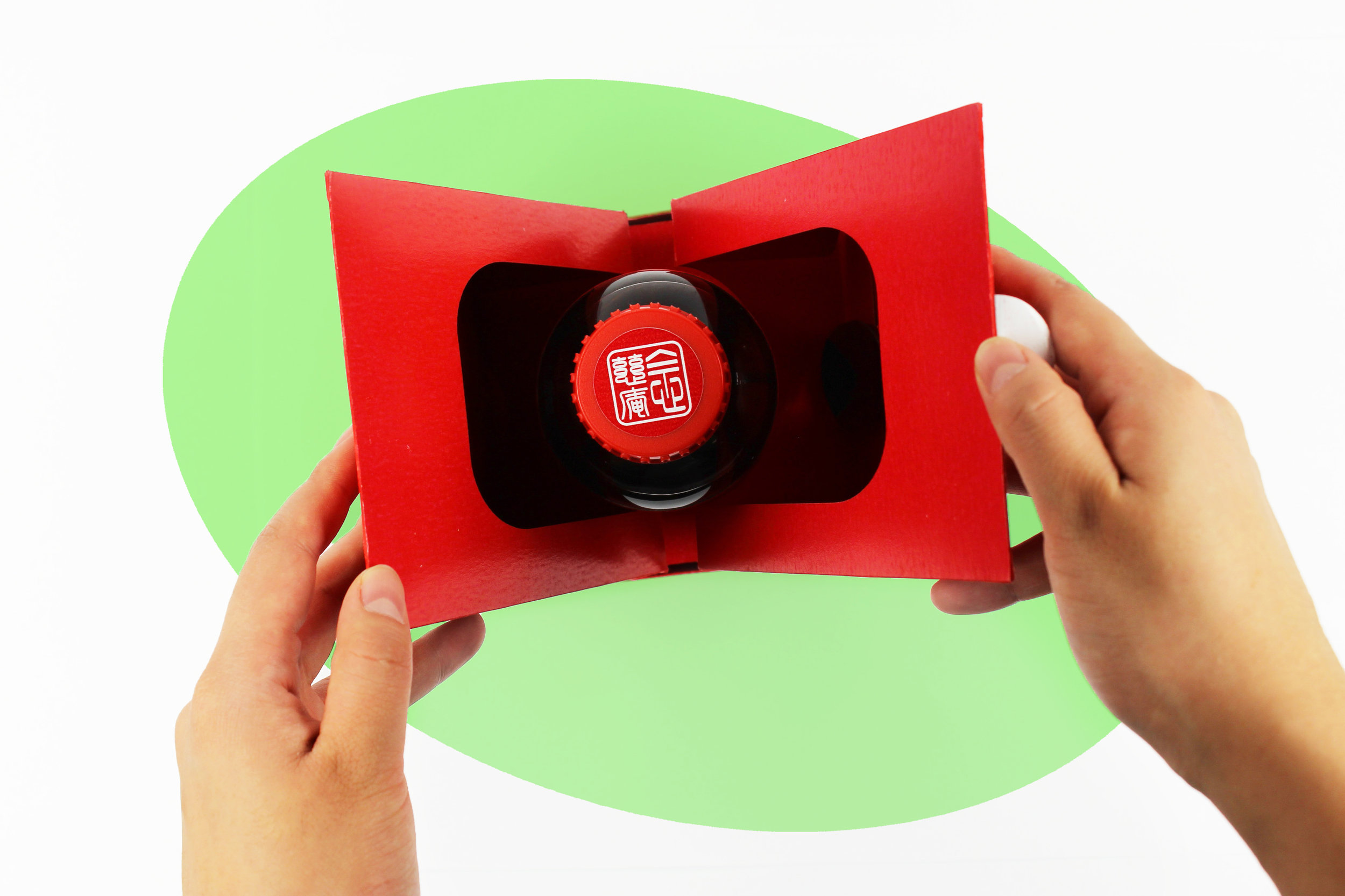
The target costumers can be younger generations. Changing to be more modern and to raise a fresh look attracting a new audience and becoming more appealing to younger people, the new packaging comes with a triangular container, which is more user-friendly and requires basic transportation and storage. Users can open the container easily by tearing off one side of the sticker at the top of the package. Users can then pull the both sides of the inside panel to get more the information about this syrup by viewing the pamphlet, and using a spoon to consume the syrup.
Information sheet
More shots
Video
PROCESS WORK
Brainstorm & Sketches
Research / Inspiration / Market Research
Experiments and modified the logos
Visualization
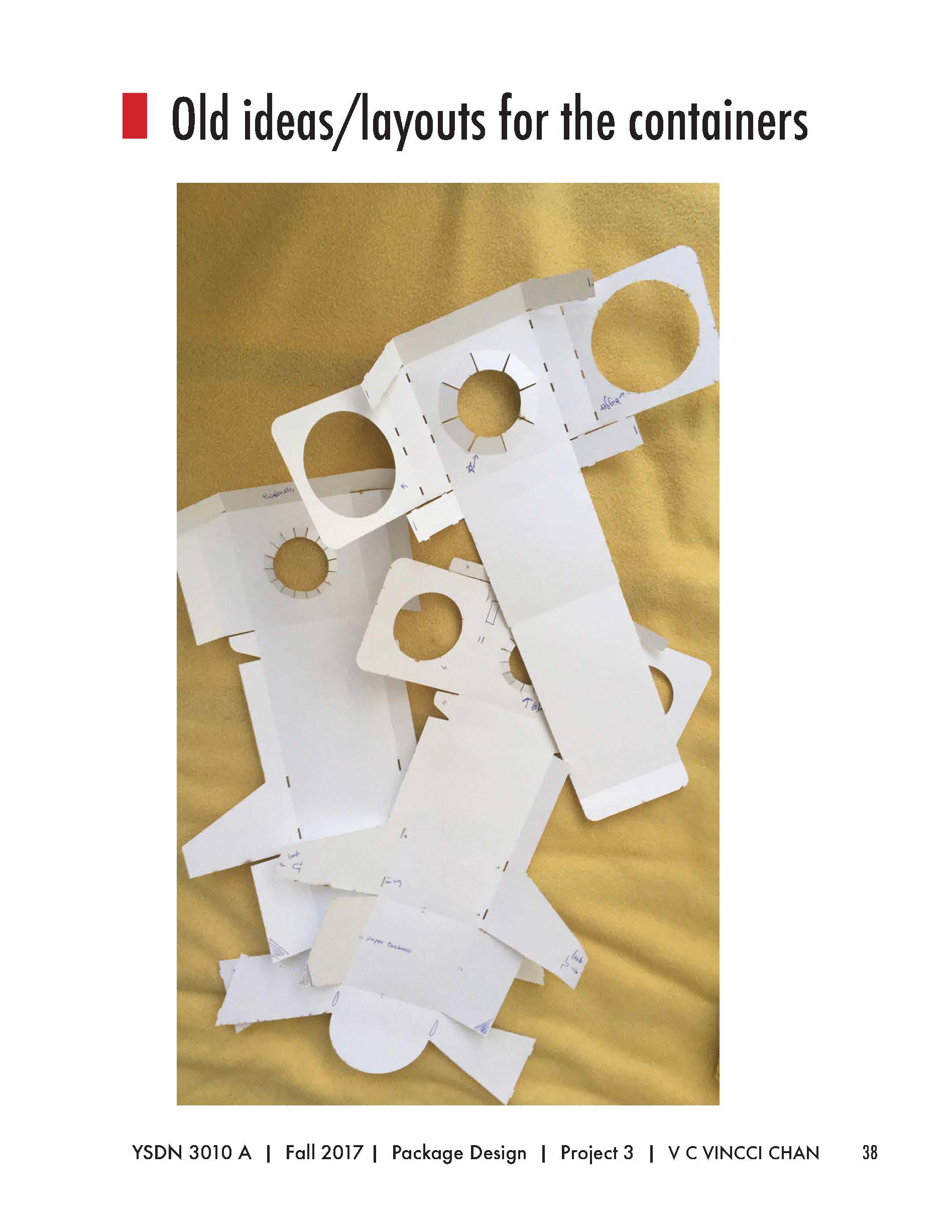
Evolution of design


